Hacker Newsnew | past | comments | ask | show | jobs | submitlogin

The article says 'positon the Hamburger in the top left corner', but many sites have it in top right too.


My I present GNOME:

https://woltman.com/media/posts/244/gr-menus-moving-around-3...

Because having a full menu bar at the top made it too easy to find options.


A full menu bar would take up too much space, then they wouldn't have room to put huge amounts of padding everywhere.


The Gnome team lives in constant terror of the end user customizing absolutely anything. So even when they allow it they make sure it's undiscoverable.


Yeah, I assumed the standard was actually top-right...

I'd be interested in people's thoughts about which side is best, or if it just doesn't matter.


I don't think it matters which side. What matters more is that everyone does it the same. Most times, I see it on the right.


You're never going to get app developers to independently agree on one consistent way to do anything. In fact, many of them will deliberately do the opposite of what everyone else does, for nebulous "brand differentiation" reasons.


I think of its default as "top left". But "top right" is frequent.

"Not quite top, mostly right" is where IBM puts their SECOND hamburger icon on DNG software. May they rot in eternity...


Most of us Westerners read left-to-right, while being right-handed.

Thus:

"Where should I go?" is answered quickly in the top-left.

Whilst experts repeatedly accessing on Mobile requires top-right.

Just depends on your priorities.


> Whilst experts repeatedly accessing on Mobile requires top-right.

Surely bottom-right?


Putting anything but your page content for me to drag to scroll in the bottom half, right third of a mobile site is a capital offense, IMO.


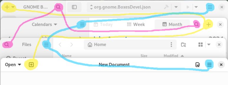
The article is wrong on that. Top left is "reserved" for the logo, top right for a menu. That's learned behaviour all across the "left to right" world.


A good compromise would be to place it in the middle. That way everybody is equally unhappy


I think 3 of them would better communicate the goal.


That's great, because the "move this panel" symbol, that is composed by a set of horizontal lines, is usually on the top-right too.


Most people use their right hand to interact with a mobile phone so it makes more sense to put it on the right side.


Guidelines | FAQ | Lists | API | Security | Legal | Apply to YC | Contact

Search: