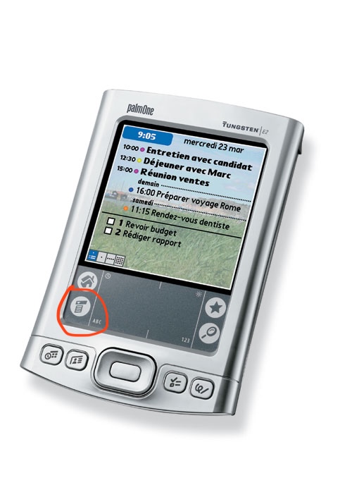
Even the palm pilot with its ridiculously tiny screen and bad touch ditigizer managed CUA-style menus.
Mobile UI design isn't about making things more understandable, it's about getting the user into a helpless and suggestible state so your ad impressions are worth more.
More than anything hamburger menu type design feels to me like an “avoid effort and skill as much as possible” sort of thing more than it does an “optimize ad revenue” sort of thing, as does flat design. It’s about lowering the bar for what’s acceptable to ship as far as you can possibly get away with. Plaster some scrolling flat rounded rectangles and a hamburger menu on the screen and boom you’ve got an app.
Mobile UI design isn't about making things more understandable, it's about getting the user into a helpless and suggestible state so your ad impressions are worth more.